Posted in 50's House in the Woods, Design Tips Included!, Finishing!, Interior Design Interest, Remodeling Projects

Fun with Finishes & Colors, at last!

After months of renovation that turned into something much more like “new construction”, the 50’s House in the Woods has finally made it through the finishing phase! It is so much fun to see the design plan come to life, as colors, textures and finish materials are applied and installed. As the designer, I carry a house like this “in my head” for the months it takes to demo, frame, build and add dimension to the house; when it transitions into reality looking exactly as it did in my head, my sense of satisfaction is “through the roof”!

Although there are many finishing touches to be added, I am going to share some preliminary finished photos, so this post will consist mainly of house pictures; I hope you’ll enjoy peeking at the almost-complete home! Before-and-after pictures coming soon….

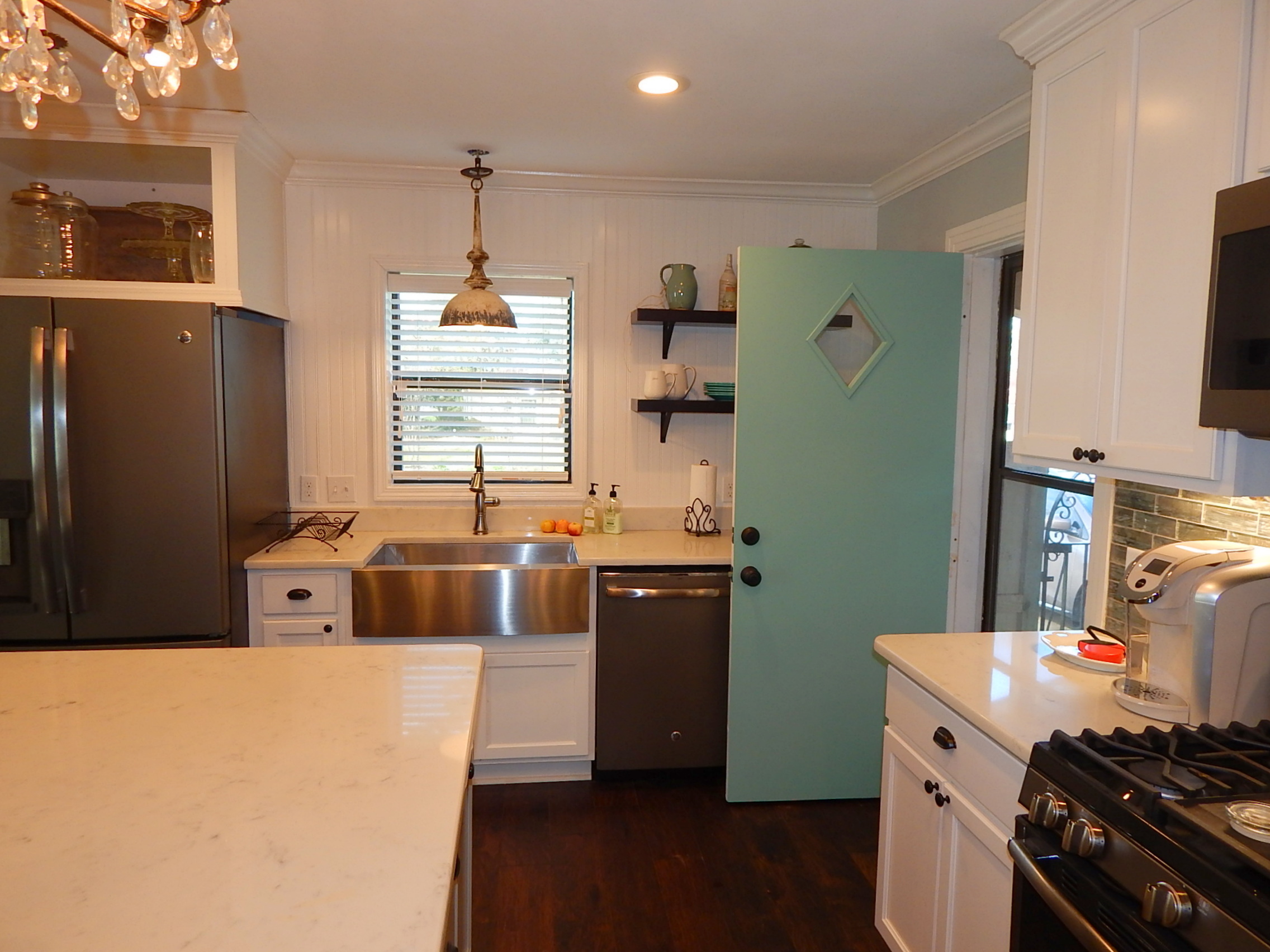
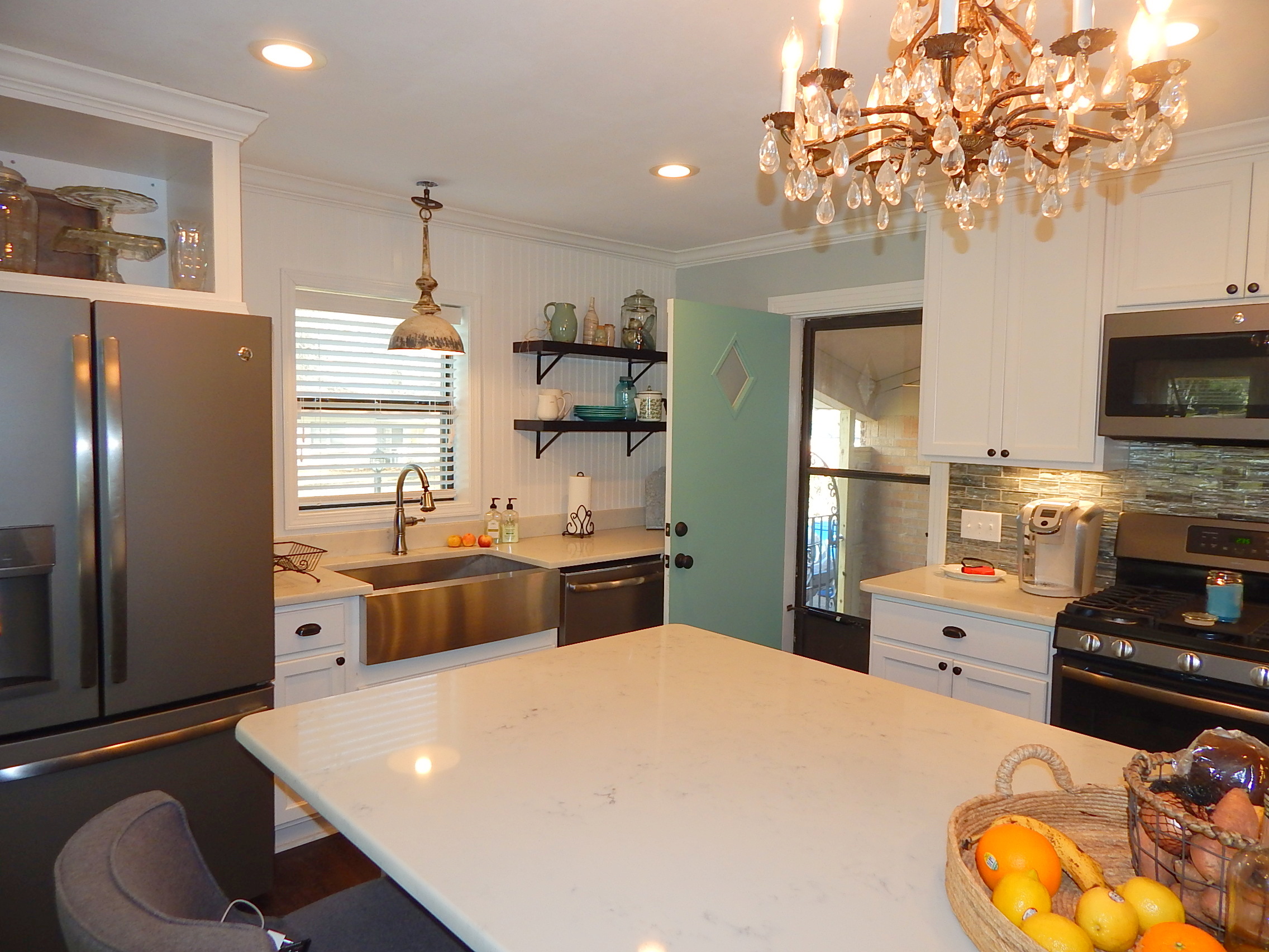
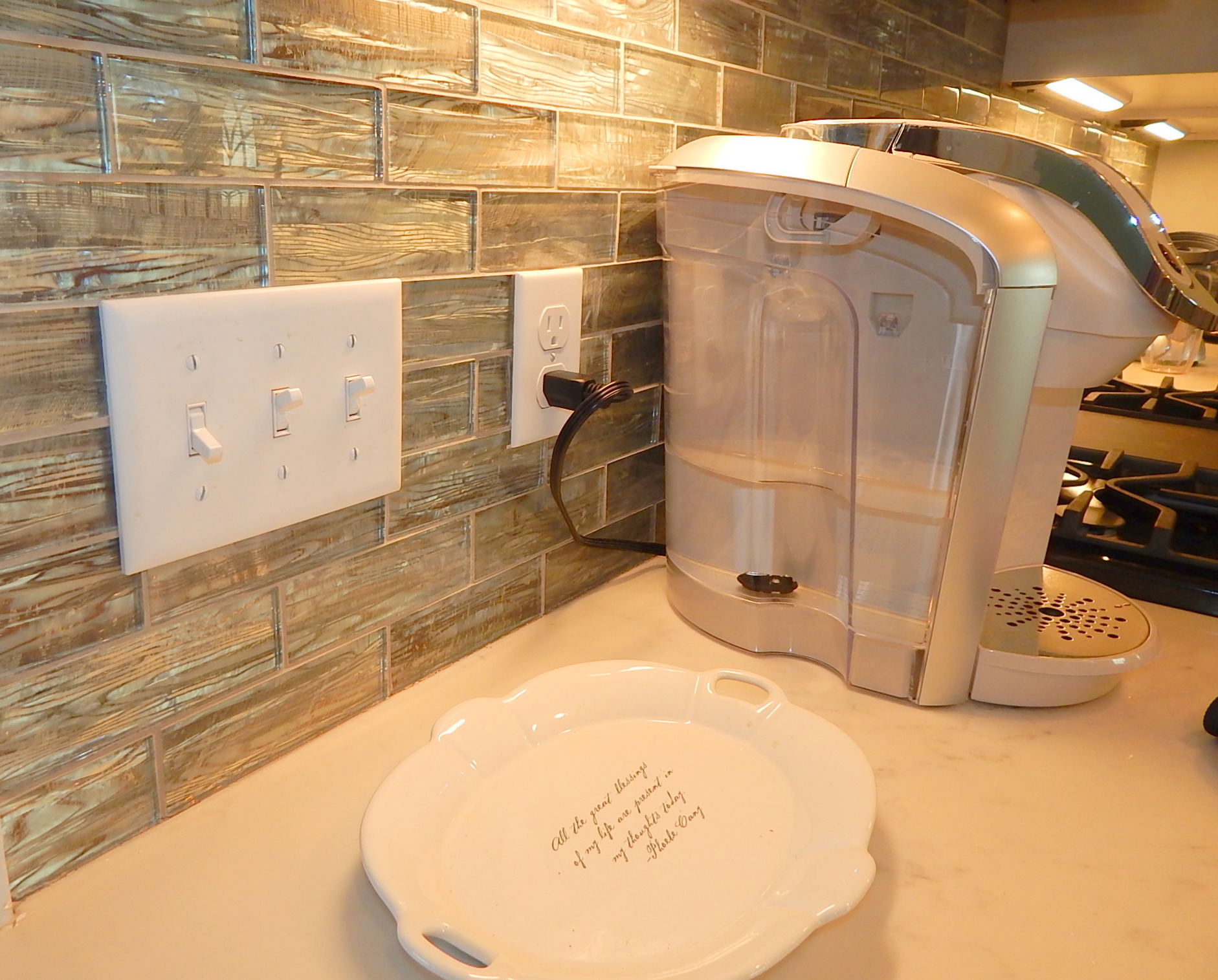
Here are a few pictures of the kitchen, just after countertops were added, but before appliances were installed! The white countertops are Quartz, while the island is Quartzite (which is also used in the main bathroom). Quartzite is “the real thing”, similar to marble but much harder: Quartz is man-made, and lower in cost than quartzite, though higher than most granite or marble.

A view of the almost-finished kitchen - cabinets by Keith Farr Unlimited

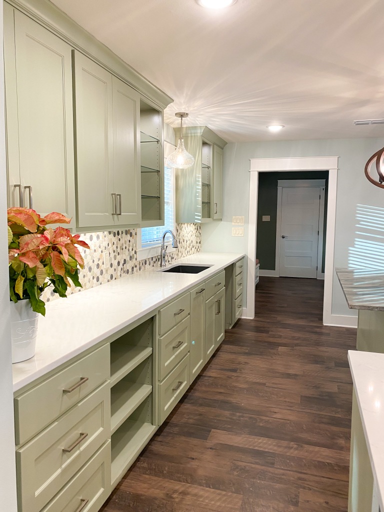
Remember the long wall we removed in the beginning? That allows the kitchen to be open to the dining and living areas….most importantly, it lets the cook see out both the front and back windows while puttering in the kitchen!

Cabinets are by Keith Farr Unlimited; the finish is a lacquer form of Benjamin Moore’s 2022 Color the year, October Mist in the kitchen, and Sherwin Williams Pure White everywhere else. Flooring is Mannington Endura Max, Dockside Boardwalk. All plumbing fixtures provided by Apex Plumbing Supply. Countertops fabricated by Arturo Gonazalez of Sandbox Remodeling, Dallas. Backsplash tile is natural stone, cut and honed into random circles

Soon you’ll see the completed look with appliances installed! The appliances are from Wolf and SubZero, with a Sharp microwave drawer and Kitchenaid dishwasher (virtually silent!)

This is the mud room, entering from the back deck and connecting to the laundry room on one end and the kitchen on the other. The tall cabinets are pantries; the drawers underneath hold shoes removed at the door. Note large storage drawers under the long bench – love these!

Here are a few preliminary photos of the Hall Bath:

This lovely countertop material is granite! I was on a constant search for white granite in the ’90’s, before quartz was a “thing”. I’m so glad they found a vein somewhere, and now we have it! Flooring is a tile called Marrakesh: I liked that it was patterned, but rendered in subtle colors so it had a vintage appearance without overpowering. The shower tile is all by Daltile, and stained glass windows were part of the owner’s collection, repurposed beautifully I think! (for those who wonder, the stained glass windows are high enough to prevent anyone from seeing through, as the house next door is lower on the hill AND on a slab foundation, where this one is raised by the pier and beam foundation) Paint color is Sherwin Williams Desert Twilight

If you’re curious about the gorgeous wood doors, they are a major design element of the house, but were very hard to find and finish! They are 5-panel solid hickory doors, sent from Homestead Doors in Ohio. There are 5 doors, all opening off the main hall. During the framing phase, I had all the hall openings lined up, and the door openings moved to where they made sense: I hope these pictures convey the effect this has on the ambience in the house!

Here we see the entry leading to the main bedroom; it first leads to the closets, then on into the bedroom itself; next you’ll see some photos of the main bathroom.

This is where the addition begins, which also includes the main bathroom and music room. Wall color is Pittsburgh Iron Gate

This is another stained glass window that was in the owner’s collection. Where the 3 stained glass windows were used, a matching new window was placed in the opening, with the stained glass window hung on the inside. This protects the glass from any breakage from outside, such as a rock thrown by a lawn mower, while making it just as visible through the plain glass picture windows.

This is the living/dining area; an existing wood china cabinet now rests between the built-in display/storage cabinets. Wall color in the main area is Sherwin Williams Quiet Moments; all trim is SW Pure White

Shown here is the library/game room area; to the right is the music room overlooking the back yard and deck.

As the interior finishing touches are going in, we moved once again to the exterior. Crews came in and removed the old driveway and 50’s front walk in a day! The driveway had always had a drainage problem, directing water right into the garage. It needed to be extended for a new carport (coming soon!), so we took the opportunity to improve the drainage, and straightened it out by removing an old oak stump that was in the way.

The old walk to the front door was a narrow walk paralleling the front of the house, and long overgrown; needless to say, it never encouraged one to enter through the front door! Now the walk is a curvy design that completely changes the front of the house and invites guests right up the walk to the front! The best part by far is the problem this walk solved: because the house is on a pier and beam foundation, there was no wheelchair access, as all entrances require going up steps. The front is a bit higher, so we were able to gently slope this walk throughout the expanse so that a wheelchair or walker could roll right into the front door! The slope is barely felt when walking, and probably not even noticeable by most guests. I love this solution to such a practical but necessary design problem! I’ll show better finished photos of the driveway and front walk in a later post, but wanted to share this innovative way to make the house more accessible!

Thanks for joining us on this journey to completely remake a 50’s house that had really good bones! It has been interesting on so many levels, but the finishing and decorating is, of course, my favorite part! I will add some truly finishing photos when the time is right…meanwhile, I hope to hear from you in the comments below! Let’s all make 2023 one of our best years yet!

Posted in Design Tips Included!, Empty Nester's Full Home Refresh, Interior Design Interest

Let me tell you a Color Story…

“A Seaside Color Story”….peaceful, serene, yet light. Natural, textural, soul-filling…truly a feast for the senses, right? Let’s think how:

  • Sight: ocean meets sky to infinity, drawing your unending gaze: sun glistening on water and causing sand to sparkle: the smooth lustre, peeking inside a crab’s shell: white fluffy clouds laughing down on sunbathers…
  • Touch: sand between the toes: the cool embrace of water: smoothness of driftwood: supple beach grasses
  • Smell: the fresh scent of ocean mist: the watery scent of a summer rain shower: coconut suntan oil
  • Sound: endless tidal waters rushing, then receding: gulls calling for attention: wind whipping flags
  • Taste: the summer tang of saltwater: freshly caught seafood: sweet tropical drinks: a cool drink of water

Reading this list, how did you feel? Reminiscent of good times? Relaxed? Did you smile?

Your home and your spaces all tell a color story; this is the story of the Empty Nester’s Refresh, and it reads so well! Walking through this refreshed home, one feels peaceful, serene, a sense of order… yet the fun of surprise as well!

Color, texture & light-reflective surfaces

We used a color palette drawn from nature, meant to evoke all of those feelings and more; the colors flow from room to room, like turning pages of a book to find you’re still on the same sentence. Each has it’s own personality, yet is related to the last and the next; the color chips you see above were used carefully to create a sense of balance while keeping the plot in mind.

Though coral is not part of the paint palette, it is the pop of color giving context to the serenity of the seaside hues. Think about the surprise of a bright tropical hibiscus or the parrot’s feathers (have you ever seen the poinsettias growing as trees in the Bahamas??) Nature handles these things, creating wonderful visual excitement in the midst of serenity; the “why” of this is that coral is opposite on the color wheel from the pale blue-greens of our palette. The use of opposites like this turns a monochromatic color scheme into a complementary one. In this type of color scheme, balance is achieved when the “opposite” color is used judiciously, for “pop”!

Pop of color from the coral rug

In this room, you see Alabaster enamel used to coat the formerly wood surfaces of the paneling and wood trim; alabaster is not a bright white, but it provides a soft, clean backdrop for our seaside palette. The wood floor grounds it all, while the bright, textural coral rug provides both visual weight and the “wow factor”!

The kitchen, dining and master suite use one of my favorite all-time “chameleon” colors as their backdrop: Sherwin Williams Sea Salt. Sea salt is technically a grayed green blue, more green than blue when seen next to a clear blue. However, it goes on the wall evoking the palest of aquas, and literally takes on the mood of what is around it (thus, chameleon). Blues are the absolute most difficult shades to pick from a paint chip! I have seen so many houses or rooms painted a shade of blue, when I was pretty sure I knew what they were going for (but did not achieve!). Blue is difficult in pigment, and as all colors, so affected by ambient light and sheen. If you want a soft blue in your room, be wary of paint chips that appear blue. One must understand the mixing of paint, the undertones, to “get it right” with blue.

Dining Room
Sea Salt, with only natural light
Sea Salt as the backdrop: coral as the Pop!

In the gameroom, we used a slightly more intense shade of blue, seen above as Sherwin Williams Rainwashed. This color pulls one in, across the alabaster walls of the pool room. Though the room is small and the color is intense, it is softened by Sherwin Williams Pure White woodwork and Pottery Barn linen draperies. (photos coming soon)

Now, the bedroom hall, guest bedroom, 2nd & 3rd baths and home office all make use of the neutral “sand” in our scheme, which took me quite a long time to choose! The pick was Benjamin Moore’s Cedar Key, and it did not disappoint. It was difficult to find this color without either yellow or red undertones that would be distracting, but in the end Cedar Key worked very well. Again, it was the contrast with Pure White trim that created the feeling of light. See how the color reacts to different moods of a few rooms here:

Guest Room
The stuff that dreams are made of…

Please do note that colors seen on a screen are not always perfectly true; in some cases, editing to correct light issues may change a color slightly – and when it does, the lighter shades tend to glow a bit pinker than when seen in person. These are quick photos I have taken along the way, but I hope they give you an idea of what a color story is: your spaces are telling their own story right now!

I hope your color story is the one you want to live in; if not, start dreaming of your ideal environment! Remember that the story is not so much about the colors themselves, but the emotions and feelings they evoke. Does your home make you feel safe, secure, and loved? Are your space’s colors all very similar (monochromatic), complementary (think red/green, yellow/purples, or blue/orange), or ALL ONE COLOR?! If you raised your hand on that last one, and the color is cool gray, how does that make your furniture look? Builders have been using gray almost exclusively for 15 years, but most are now turning to warmer tones in the tan or rose family.

Not that I’m on board with this choice personally, but click here to see Sherwin Williams’ new color of the year for 2023: like it or not, you’ll begin to see products of all ranges in this or similar tones. Do not be influenced by the latest “in” color, unless you want to: color is personal, just as art is. Use color to express who you are, how you want to live, and how you want the world to see you and your family. If you’re unsure, always feel free to call me up for a chat – let’s consult!

I’m off to show a young couple some houses on this beautiful fall day, but I would love to hear your thoughts & comments on one of my favorite subjects – COLOR! Hopefully we will see some FALL COLOR here very soon – until then, enjoy your life and spread some cheer – happy autumn to you!

Posted in 50's House in the Woods, Design Tips Included!

The 50’s House is Coming Back to Life!

Hello my friends – I apologize for the lag in updates on The House in the Woods….we’ve been very busy finishing up the exterior, and are now making big strides inside as well! Our “project” is beginning to look like a house again, and we couldn’t be more excited watching it emerge ~ hopefully I’ll be able to convey some of the excitement to you in progress photos!

Newly painted & shuttered!

I had to jump ahead because I’m so excited about the exterior paint colors and cedar shutters! The image living in my head is finally beginning to emerge, and though there are a few more exterior details that will add to the story, this part is fun to watch!

If you’re considering painting the exterior of your home, I strongly recommend testing several shades first (see below for ours). Picking colors from tiny paint chips is an art any time, but it can be especially difficult when you’re choosing for the exterior. Your color will be distorted by all of these things:

  • Type of siding material
  • Direction of sun exposure
  • Amount & height of trees providing shade
  • Secondary colors (roof, shutters, windows and doors)
  • Gloss level of paint and/or stain

I was looking for a color that would allow the house to “melt” into the woods; my goal is that it look like it’s always been there, belongs there & does not detract from the beauty of it’s surroundings. Finding just the right shade of warm green/gray proved to be more difficult than I expected: here you see where we tested the 3 finalists chosen from among dozens of contenders. The cedar board is leaning up against the wall to represent the shutters and outdoor living area trim: since the ‘red’ in cedar would be complementary to our color (think opposite on the color wheel) it provided an important element in choosing the final color. In chip form, all of these colors looked very good; however, the one to the right of the cedar board looked very green outside, much to my surprise! The color all the way to the right went up looking very light and more blue gray than we wanted. The color to the left seemed way too dark, but I had tested it for contrast….and I bet you guessed it already: that one proved to be the hands-down winner! It still looks different throughout the day as the light changes, but it definitely has the river rock effect I was looking for. The dark strip above the sample is the color we sampled and used for the trim, garage door and outdoor living area ceiling. Here are the colors in case you’re curious, both mixed using Benjamin Moore paint:

Exterior Paint Colors

SW Enduring Bronze 7055 & Benjamin Moore Wildwood Crest 1538

Paint colors on the siding and soffit

Since the last progress post, we have also finished all the electrical and plumbing rough-in, had the finished roof installed, had foam insulation sprayed into all the exterior walls and attic areas, had all new sheetrock installed, and have had it taped, bedded and textured. The cabinets and built-ins are all being built now, and should be getting their lacquer finish sprayed this week; once they are installed, we can have templates made for all of the countertops.

This week the carpenters will be back to do the interior trim-out, which includes all door and window facings, cased openings, and closet detailing throughout. They will also finish installing the deck boards. For both beauty and ease of maintenance, we are using a composite decking material; while Trex is the best-known brand of this product, we chose Armadillo brand, which saved about 1/3 on the cost.

One of the most difficult parts of remodeling/building right now is gathering the materials; the supply chain is still an issue, and the oddest things are nearly impossible to find! For example, on my last job we used Leviton switches and outlets in white: they were in short supply everywhere! I had to get very creative to find enough to finish that job. This time we’re using the same, but in the color Biscuit, which is apparently not so popular at the moment: I ordered all we needed at once!

While we have sourced our share of products through Home Depot and Lowe’s, we have also been fortunate enough to use 2 smaller local suppliers for most of the “big stuff”, and they have cheerfully delivered each load as it was needed. When I ordered the sheetrock, Lowes had the best price, but I had to wait a few days for my delivery since every other builder in town was doing the same. As it happened, the roofer was having shingles delivered the same day from Home Depot, which I didn’t know. We had also ordered a new giant dumpster 4 days before this, which involves a big truck coming to drop it off. I always sweat the deliveries, as logistics on the job site can be challenging; but this time it was really a circus! The Lowe’s truck showed up 2 hours late to offload 300 sheets of sheetrock; as we were discussing where he could best put it to leave room for the eventual dumpster arrival, the Home Depot truck pulled up with the roof shingles. This is a very narrow residential dead-end street with drainage ditches on both sides, so there was no possibility of both trucks getting close to the house at one time. While they were discussing HOW to offload both trucks at once AND where to put everything, the dumpster truck pulled around the bend! All 3 trucks lined up down the street, which was comical in this tiny neighborhood! Then the across-the-street neighbor picked that moment to leave the house, but literally couldn’t get around the caravan of trucks until the 2nd and 3rd trucks backed up.

Trucks 1 & 2
There’s another stack behind the white SUV: 300 sheets!

Below I’ll post a few progress pics that got us here, but here’s a preview of some of the rooms with first foam insulation, then sheetrock:

Master suite vaulted ceilings with foam insulation
Sheetrock! We have walls!

Next week I will share the design plan for this home, including the overall concept and how you’re about to see it come to life through colors, texture, tile, lighting, flooring and fabrics. For now I will leave you with some photos of progress in the last few weeks….I hope you’ll find some ideas or inspirations along the way – and please feel free to reach out in comments if you have questions or observations! As always, I wish you all the blessings of the season, as we enter not only Autumn, but the beginning of “the holidays”! Dig out those sweaters and rain boots!

Jose replacing bricks where windows were removed

By the way, look at that difference in roof pitch!

Posted in Design Tips Included!, Empty Nester's Full Home Refresh, Finishing!, Interior Design Interest

Empty Nester’s Refresh – Almost finished!

We are nearing the end of this huge remodeling project, where we have literally “refreshed” every part of this beautiful house in my hometown of Greenville, Texas…my clients have moved back in and are gradually unpacking and finding the new normal in their gorgeous spaces! We need some time to get things all settled before taking any true “before and after” photos – but I can show you some of the fun leading up to the finish line!

Living room on ‘furniture day’

This photo was snapped on “furniture day” – and what a day that was! We had ordered a houseful of furniture beginning in February for a project that actually began in June, due to a family wedding. With the supply chain being what it is today, we thought it best to start early to be sure we’d have furniture when ready. Box after box came in and was stored in a local climate-controlled storage building, awaiting the big day…and finally it came one day in August! A friend with a box truck, 2 strong guys, and a handful of workers later, my client’s front lawn was covered with many, many boxes, rugs and mirrors!

Furniture Day!
Move it all in….!

A few product notes of interest from the living room photo above: first, the rug. My clients asked for the new design to be “light and airy” with use of the colors teal and coral. In this room, the first layer of “light” came from painting the rich (but dark) paneling a light color, using semi-gloss enamel in Benjamin Moore’s Alabaster. The beautiful replacement windows by Pane Windows and Doors add the BEST light, along with a gorgeous view of their pool and outdoor park-like acreage. We had planned for the furniture to be light neutrals, but I wanted THIS RUG to be my one pop of coral to set the tone for the whole house! Back in February, I was on the hunt for a coral rug – not an easy feat at all! When I found this one, I knew it was going to be perfect – but it was a huge risk! It would either BE perfect in the room, or an expensive error….no in between!

Why the risk? Well, I’d never had experience with this type of rug, and I was buying it online. The color couldn’t be any more orange or pink; it had to be spot on coral! I have dealt with many wool rugs, usually high pile and often Persian style, with intricate multicolored designs. This one came from an old Persian rug that had been shaved and vegetable dyed: the high pile was actually shaven to make it a low pile. The Persian design would then show through a bit, but not be prominent…and the subtle vegetable dye would then overtake the colors, making it basically one color (though many various shades due to the undertones.) OK, so the rug was folded up in my warehouse for months, where I could see the back, but only a small part of the front. The back was much more ORANGE than what I could use…and the rug was much too large to get a good view of the top side! On furniture day, when everything was moved from storage, I had guys helping me lay down the rug pad and rug in the room; I was pretty apprehensive! This rug would make or break the room, the first room one sees when entering the house, and the room my clients will spend the most time in.

Here’s a closeup to give you a better idea, and the reminder of the effect of the rug on the whole room:

The result? Perfection! This is the happiest of rooms now, grounded by the visual weight of intense color on the floor – and the color is tempered and toned by the warm hickory tones of the wood floor it sits on. Soon you’ll see the further important ‘layers’ from linen panels framing the view from each of the beautiful windows, and accessories added to finish off the room. On furniture day, we all took a collective sigh of contentment when this formerly dark room came together so beautifully!

One more item of interest: notice the Samsung Frame TV hanging over the mantle? This gorgeous TV looks like a piece of art when not in use, and lays perfectly flat against the wall. It is indeed “framed” by a bezel, which comes in 3 colors at the time. Samsung sent an installer through the Handy app, so all we had to do was prepare the wall by removing some of the picture-frame moulding to leave a large enough flat surface. If you remember, the room had a much larger mantle which we removed in order to be able to hang the TV lower, the right height for the distance from seating. A few pics of the progress/process:

Hanging the Frame TV

The kitchen is a work of art, to be revealed soon in much better photos than I have at this moment, but here is one shot:

Kitchen – almost finished!

Walls, Sherwin Williams Sea Salt, flat: Cabinets, Sherwin Williams Pure White Semi Gloss: Backsplash, Artigiano picket by Daltile: Countertops, Quartz: Appliances, GE Cafe White

My client may well be the most organized person I know! She is having a blast filling up her new cabinets provided by Keith Farr Unlimited. Just take a look at some of her killer ideas for organization here – highly steal-able and so worth the effort!

That’s a bookshelf sitting inside the high cabinet!

Here’s a shot of the breakfast room in progress on Furniture Day:

Breakfast Room in progress

A few bathroom-in-progress shots:

I hope you’ve enjoyed seeing a few of the “almost finished” shots from my Empty Nester’s Refresh – it has been such a delight watching the design come together after all the hard work! We are still waiting on a few items to show up and/or be installed, so I hope to bring you more finished views soon! My clients and I are working on adding finishing touches to all of the spaces, including as many of their “things” as possible. Everyone has collected things over the years that have meaning to their family, or have kept certain pieces to remind of lost loved ones; it is important not the simply decorate the space of one’s home, but to use objects that evoke feelings and memories. Yes, we will add new things to the old, but sparingly. These are a couple of elements we’re working with that add their own sparkle to the spaces:

Thanks for visiting today – we are working hard on The 50’s House in the Woods, even as this project winds up. The 2 projects could not be more different, yet they’re both very special to me, as the designer! The principles of good design are universal, but it is exciting to see them play out in homes with such different elements and goals. I hope you’ll continue to follow both projects ~ having you along makes it special!

Reach out or comment if you have questions or observations…or of course, if you’d like to talk about a project at your own abode! If you’re doing renovations yourself, or have just finished, we’d love to see! Feel free to post some pics in the comments below ~ see you next time! Happy September!

Nancy Chapmon, aka The House Ladee!

Posted in 50's House in the Woods, Design Tips Included!

Framing: the Key to a Successful Remodel

I’ve had a few questions about what’s going on NOW at the 50’s House in the Woods! Well, we had a short break for the past couple of weeks (for the most part) while waiting for some materials to arrive. That wait corresponded nicely with other urgent projects for the carpenters, plumbers, HVAC guys, electrician and…..me! I’ve been doing finishing on my other current project, the Empty Nester’s Refresh, and that has been intense! Now it is entering the final week, including new furnishings & finishing touches. This week work ramps up once again on the 50’s House, which is quickly becoming something much more modern, as you’ll see!

Newly framed Master Suite

While one crew worked hanging siding on the exterior of the new addition, and various old areas in need of new materials, the framers moved to the inside to give definition to the new space. At the same time, they redefined some OLD spaces in preparation for their “best and highest” use! The photo above shows the new master suite from the entrance; you can still ‘see through’ the back wall of the bedroom into the architecturally stunning new master bath!

A large soaker tub will be featured under the peak of the vaulted ceiling, with windows above designed to frame the private view of oaks and stars, as this faces the back yard and private acreage beyond. To the right is the walk-in shower which will feature some amazing ceramic tile, a corner bench and an extra large shampoo niche that becomes an important design element. Here’s a clue from the tile display that inspired us:

What’s a modern master suite without ample walk-in closets?! In this case the former master bedroom/bath becomes the connector to the new suite: it includes a small “entrance” to the suite with a short hall flanked by his ‘n hers closet rooms, shown here:

The closets, formed from the “old” master bedroom

This might be a good time to point out HOW IMPORTANT good, thoughtful framing is to a successful remodeling project, assuming some walls are moving or spaces within a room are being redefined. In this project, almost all of the walls moved, either just a bit or totally – and one major supporting wall was removed completely! (If you missed that, here’s how that happened)

So back to framing….there are often small changes that can be made to redefine spaces for better use; it can be due to changing lifestyles, or sometimes just poorly thought-out plans from the original builder. (examples to follow). But while demo is going on, you should really think about changes that will make a difference. In this case, since we tore walls down to the studs in order to rewire, replumb and redo the entire roof structure, we had the opportunity to rethink all of the interior spaces ~ and, since this house is on a pier and beam foundation, all things were possible!

Here is an example of making the original design work better: bedrooms 2 and 3 both had long closets, which were placed side-by-side but opening into each room, of course. First, the closet openings were too large, so were accessed with overly wide sliding doors – 3 in fact. With that setup, one could never open the doors wide enough to reach all that closet space! It was needlessly tough to actually use the closets. In addition, the closets were placed in each room in such a way that they took up the whole wall, making it unusable for furniture. It may be hard to see here, but I’m going to show you how we reversed the closets in each room, thereby leaving usable space. In one room, there is now a nice large corner to place a dresser or reading chair and table; in the other room, which is typically used as an office, the closet is easily accessible (not behind the door) and by moving down the door we also created an area for the exercise bike behind it. Some of this will make more sense when you see the spaces with sheetrock and doors, but take a peek:

In what was formerly a den, JUST next to the living room and kitchen, we are creating a game area flanked by 2 walls of built-in bookshelves – carving out a “room” that will now be useful AND beautiful! This room opens to the sunroom, kitchen and living room:

In this 50’s house, there was the period-typical bedroom hallway, with 2 bedrooms on one side, the master on the other, and the hall bath at the end. While that design works pretty well in practice, for some reason nothing “lined up” in this one. The decision was made early on to make a major design statement with the use of solid hickory 5-panel doors in the hallway; while other doors in the house will be painted, these will be wood. But…none of them lined up, so they could not be seen at the same time. The bathroom door was not centered on the hallway – and I wanted it to be! I wanted one to look from the kitchen or living room and see the gorgeous hickory bathroom door in the center of the hallway – and the other hickory doors lining each side of the hall. Small changes made this happen (my framers may not agree the changes were ‘small’ but I say they were!) Again, this will all be much easier to see when we have sheetrock and doors, and finally, with paint, stain and trim! But the framework for these all-important design elements must be done at THIS stage! I think I have a couple of photos that show the beginning of what we laughingly called “lining it up” during framing!

Lining it up!
The hall bath door CENTERED on the hallway

The kitchen is the part that will be the most fun to show you, but it’s difficult to ‘see’ right now; I’ll show a couple of photos so you can later see how well you were able to visualilze! There will be lower and upper cabinets along the outside wall only; in the center will be a large island, and all other cabinets will be ‘lowers’ only – thus opening the space to the surrounding rooms. While cooking, my client will be able to see out the front and back picture windows and interact with those in the living room, gameroom or sitting at the counter stools. Here’s an early view to ponder:

Kitchen from the Game Room/Sunroom

I have one last thing to show you today ~ the beginning of the outdoor living areas! First, there will be a small screened porch opening off of the master bedroom; it is just framed enough to allow the roof structure to be added. Then there is the main deck extending from the back (main) entrance. Again, the roof structure is done, allowing us to get the entire roof framed and ‘in the dry’. Soon they will go ahead and do the finish out, consisting of the following:

  • Build a deck “floor” the same height as the interior spaces
  • Connect the outdoor living area with the sunroom by building a deck walkway
  • Wrap the deck supports in rough cedar
  • Finish off the vaulted ceiling and add lights and a large fan
  • Finish off the vaulted ends with rough cedar
Antique stained glass incorporated into the outdoor living area

This coming week we see the plumbers starting to redo ALL the plumbing under the house, replacing old pipes with new and replacing the old tree-root-infested sewer line. They’ll then set the rough-in for all interior tubs, faucets, and appliances. This phase will not be blog-pretty!

The electricians are also starting to update all the wiring; the old wiring was not even grounded. They will then set up the proper wiring for all new appliances, lights, switches and outlets – also not a pretty sight!

The HVAC guys will set the new 5-ton efficient unit (in the newly higher attic this time!), then begin building all new flexible ductwork, with returns in each room. All of this work will be done with the knowledge that foam insulation will be used in the walls and attic of the house later. So many things at this stage are affected by that decision – so don’t let it be an afterthought!

The flooring guy has been out to measure now that everything is framed; we’ll be using Mannington Adura luxury vinyl plank, and because of supply chain issues, will go ahead and get the material on order. This house will contain plenty of custom cabinetry, so we’ll get Keith Farr out to measure for them as soon as he has a break in his schedule. Meanwhile, the sheet rockers are planning to start in approximately 3 weeks – and that’s when I’ll update you next!

As always, thanks for checking in to see our progress: I hope you’ve seen at least one nugget that somehow helps you on your own journey through life. Until next time, live with intention & enjoy every day you have! Blessings, my friends!

Posted in Design Tips Included!, Empty Nester's Full Home Refresh, Interior Design Interest

What Makes a House Beautiful?

There is no simple explanation of ‘what makes a house beautiful’….I have been in many homes, considering my interior design and real estate careers combined, but I will say there is no one thing, no formula, and no exact recipe for creating a beautiful home.

I have been in homes that felt beautiful, yet were out of date technically: I have been in homes that were fully up-to-date, with all the “right” finishes, yet seemed somehow lacking. Naturally, the warmth and personality of the home’s owners imbues the intangible magic ingredient to a beautiful home, but I can give you a few ideas of the elements that always combine to create beauty – and anyone, on any budget, can make this happen!

Throughout the rest of this series, which features my project I’ve named “Empty Nester’s Home Refresh”, I will try to point out the elements and how we’re using them in this home. Let me first say that my client’s home was beautiful before we even started! They had created a lovely atmosphere their family had enjoyed over the years; the home itself had/has “great bones”! It featured absolutely gorgeous picture-frame paneling in the living room, a wood ceiling with stained glass insert over the pool table, nicely proportioned rooms, and a yard and pool anyone would want!

All that said, my clients were ready to refresh and update the look, and in the case of the kitchen and master bath, the utility of the spaces. They expressed a desire to have the home feel ‘light and airy’, gearing off a color palette of teal and coral. So many decisions were made instantly by those simple requests!

Here are a few of the ways to create a feeling of “light” in your interior spaces:

  • Light reflective surfaces (more on that as we go)
  • Light, semi gloss mouldings and trim
  • Contrast! (This one may surprise you)
  • A combination of proper lighting, placed correctly
  • Balance of colors/textures
  • Light colors, but NOT all white (remember contrast?)

Now for the “airy” part – this is more intangible, but comes from the careful use of design elements such as balance, use of texture and simplicity. A hint of how:

  • Simple, clean lines in furnishings
  • Open spaces, wide, well-lit walkways
  • Keeping “visual weight” low (darker floors, lighter walls for example)
  • Large windows with minimal treatments

Now, this feels a bit to me like an oversimplification, as good design has so many more elements to keep in mind…one of the most overlooked being acoustics! For example, if you take away carpet in favor of a wood floor and also have large windows, you’re going to have sound bouncing around the 6 sides of the room! (floor and ceiling count). That’s where you start layering to create balance (a rug, fabric side drapery panels, upholstered furniture etc). But enough of “design class”, you want to see colors, right?! Let me share:

Color Palette in paint

Color chips can be distorted online, but this shows the relationship of colors being used in the house: Sherwin Williams’ Sea Salt is a very pale blue-gray color that sets the tone for my client’s accent colors of teal and coral. Sea salt is ACTUALLY a green, but goes up looking more blue. An actual shade of blue goes on the wall looking much too bright, and overtakes the room in most cases. I’ve found this is one of my “chameleon” colors, meaning it takes on it’s surroundings as a perfect backdrop. Wall colors throughout the house will be Sea Salt, Alabaster and Cedar Key, with Pure White mouldings throughout. Two small rooms will be Rainwashed, a slightly more intense pale aqua.

Clearly the colors themselves are light, but the FEELING of lightness will come from the contrast with semi-gloss white trim. Contrast creates light, even if you use a dark wall color (in the right circumstances!) Where this home has featured many wood surfaces, most will now be white, with selected wood areas such as kitchen beams, pool room ceiling and two sets of doors plus the entry doors being left stained. To keep this overall look from being TOO light, we balance it with a medium-tone hickory wood floor (texture and balance). Then we tone further with layers of texture and pattern, sometimes from rugs, sometimes a patterned tile floor…here is one example showing toning:

Color Palette with toning, texture & pattern
Layering with linen drapery panels

These are just a few clues from the plans for this home refresh, but to create a beautiful space, just remember to use balance in all things: balance of colors, textures, light, and acoustics. Example of a balance of textures might include a room that makes use of wood, fabric, metal, glass and pattern. You can easily add balance sometimes by the simple addition of textured/colored throw pillows, for example. If you’re going to paint a room, think about where the visual weight is, or needs to be: if the floor is light, consider a medium tone on the walls, with light trim. If the floor is darker, lighten up the walls. If you’re working with stained wood trim in the home, the walls will probably need to be a shade of white, and you’ll need visual weight (color and texture) on the floor. I hope this brief lesson in balance starts you looking around and thinking! Whether you want a weekend refresh or a full redo, just keep the basic elements in mind and you’ll be happy with the results!

Now, before I let you go, here are a few updates on the progress at the Empty Nester’s Refresh: new walls in the kitchen and bath have been sheetrocked and taped/bedded/textured to prepare for finishing. After a few modifications (they left phone jacks??) tomorrow, the painting phase begins. We will use primer and oil-based enamel on all wood in the house, and flat latex on all walls and ceilings. A quick note about flat vs satin or semi-gloss: the house’s walls and ceilings are textured in crow’s foot texture. Using a paint with sheen creates tiny shadows everywhere, as it calls attention to all the lines in the texture. The use of quality flat paint lets the walls become the backdrop for the clean lines of the furniture and adds a light & airy feeling to the house.

The new closets and cased openings have been trimmed out, also ready for caulk and paint. We cannot put down new base moulding until finished floors are installed, so that comes later. The custom cabinetry is ready, but since it will be installed finished already, we need to get pretty far long in the painting before installing the cabinets.

Tile installation will begin in another week, to include 2 showers, all bath and back hall floors, and the kitchen backsplash. It’ll be fun to share those finishing details, when it all starts to look beautiful again, but for now just know it’s coming! We are finally through the messy construction phase of this project and embarking on the much-more-satisfying finishing phase! Thanks for following the progress – I hope you have read at least one thing that helps you improve your own home spaces!

If you need a bit of help, you might consider a consultation; I am truly passionate about helping others live their best lives through environment!

Posted in Design Tips Included!, Empty Nester's Full Home Refresh, Interior Design Interest

Out With the Old…

Welcome back to the “Empty Nester’s Home Refresh” project! Today I’m updating you with a glimpse into demo….where we remove the old fixtures, carpet, lights, cabinets, etc, to begin preparations for the NEW!

Needless to say, this phase is a mess! We managed to fill the dump trailer to the brim twice, carting off debris and fixtures that could not be recycled. As a side note, I’m happy to say that a local investor/remodeler was able to take quite a bit from the house prior to the actual demolition, and it’s nice knowing many fans, lights, faucets, and even doors will be recycled and reused soon. I’m always happy when the landfill only receives actual trash, and as much of our waste as possible finds new life elsewhere.

Master Bath BEFORE DEMO
Master Bath AFTER Demo

As you can see in the master bath photos above, we removed all of the fixtures and walls from the existing room; after removing the HUGE round tub, made of and surrounded by cast marble, we were surprised to find an actual HOLE in the floor beneath the tub! By this, plus the fact that old wallpaper was behind the walls of the tub surround, it is clear that the tub and shower we just tore out were not original to the house….still, the plumbers should have filled in the floor properly last time. After relocating the drains for the tub and shower, our plumbers poured new cement to close in the chasm and protect the pipes (see below)

New tub, set with spray foam for stabilization

I’ll show you more about the plans for the master bath next week, but I did promise demo pics, so here are a few of other areas in the home:

Living Room During Carpet removal
Living Room, Mantle Removed

Pulling up carpet often reveals a mess, with trying to remove the pad underneath; it’s not unusual for the pad to stick in random spots, making it necessary to use scraping tools to get it all up. The carpet tack around the perimeter of each room is also very difficult to remove, as it is actually nailed into the concrete floor ~ our guys did a fantastic job of removing ALL traces of the carpet. We also removed the dated wood mantle, but for a very good reason OTHER than aesthetics.

To improve the furniture arrangement in this large room, we decided to place the TV over the fireplace. While this is not a unique idea, that placement often leaves a TV too high for comfortable viewing from the room’s seating. I see this often; people are unable to sit back far enough from the TV to prevent an uncomfortable neck position while viewing it over their mantle. By removing this mantle, we will be able to mount the TV in a lower position that works comfortably without causing my clients future neck problems! (I have found a beautiful live-edge walnut mantle which will be placed on the bricks, thus lowering the overall arrangement)

Kitchen prior to demo
Aaaaand…it begins!

Quick note about the plans: while the new cabinet footprint remains very similar to what was here, it “fixes” several design problems, which will make using the new kitchen more pleasant and productive. Of course, it will also be up-to-date, with beautiful new finishes, fixtures and appliances. I can hardly wait for you to see the new kitchen emerge!

Kitchen, cabinets & tile cleared out (pantry doors sneak peek)

This kitchen had electric appliances, though gas is available elsewhere in the house; my clients elected to go back with an upscale gas range, which will sit in front of the half-wall you see above. We have framed in the wall there to accommodate the new arrangement, and widened the cased opening to the breakfast room. Since there was no gas to that location, the plumbers were able to bring in the line through the attic, drop it close to the range location, and bring it over to the exact spot. Like this:

New gas line mounted in newly framed full wall

I’ll show you one more area I think might be interesting today: in the Game Room, there was an old wet bar that has not been used that way for many years. My clients made the best of the space, though having a sink along with mirror-backed upper shelves really wasn’t conducive to anything else! My least favorite thing about the bar, from a design standpoint, was how is was jammed up against the wall on one side, making that side of the room feel off-balance. (it was that way because it backed up to a bathroom vanity on the other side of the wall)

Having decided to close in this area to make a game closet, we were going to have narrow double closet doors framed in. During the kitchen tear-out, I realized the former pantry doors would look much better there than the regular white closet doors I’d planned! Because they are narrow, we were able to center them on the space, which means it won’t look “jammed up against the wall” when it is all finished out. The solid wood doors also match the wood ceiling over the pool table and another set of wood and glass doors that separate this area from the kitchen. WIN! I hope you can see the transition in this series of photos:

“New-old” Pantry doors find a new home!

I leave you this time with a few things we are saying “goodbye” to! Out with the old, and soon…..in with the new! On the job, we have framed in the new bathroom and kitchen, and the plumbers and electricians are hard at work on the rough-in phase of their work. By the end of next week, we will have new sheetrock hung, then we’re really on the way to exciting times!

Next time I’ll share plans and colors, then soon I’ll introduce you to our (no kidding) rockstar electrician! Stay tuned, and thanks for joining us on this fun project!

Posted in Demo!, Design Tips Included!

Meet the “50’s House in the Woods”!

Hello again! I took 3 years off to move to Colorado and “do life” with my daughters, Kiki & Lynzee, but alas, Texas called me back and here I am, in my hometown of Greenville, and jumping right back into real estate & remodeling!

I pretty much love ‘ALL things houses’, so both matching them up with new owners and giving old ones new life are my passions. I feel so fortunate to have the opportunity to do what I love so much….and right now I am blessed with 2 very exciting remodeling projects right here in Greenville! Today I’d like to introduce you to the one I’m calling the “50’s House in the Woods”…

50’s House in the Woods ~ after interior/exterior demo

This house sits in a small neighborhood of mostly mid-century modern homes constructed in the 1950’s and early 60’s. As a child, Oak Village was one of our favorite destinations when driving around looking at Christmas lights! There is one house in the bend of this dead-end street that looks EXACTLY the same as it did when I was growing up! Most of the others have been updated, several paying close attention to the MCM architecture. Now it’s time to give this home with ‘excellent bones’ a new lease on life!

This house is the classic late 50’s ranch, but with a forward-thinking layout. Clearly built as a custom home, it has so many elements that were “the best” at the time….however, progress and innovations in home design can lend a hand to make it much more livable today. So….here we go!

Exterior prepped for remodel

Today I’m going to highlight demo and prep work to the EXTERIOR of the home only (next time I’ll show you what it means to go “down to the studs” inside!)

We tend to think of “demo” as only interior, but this house is truly getting a complete reset, so the outside is just as important. The 50’s bricks were originally pink, as you may have seen on other homes of that era. While I’d love to design around the original brick color, the house has been painted at least once – so it will get a new coat of paint once the bricks are thoroughly power-washed. We are also adding 700 sq ft to the rear of the home, so we will want the new siding color to match the brick color.

50’s pink brick showing around old garden

For a peek at the original pink brick, just follow the arrow; you can see they painted around existing gardens before – which is why we are now removing all vegetation and the built-in planter around the foundation – a few “before” pics follow…

front before landscape clean-out
East side overgrown with vines

Poison oak and ivy had prevented maintenance on the east side for some time, so a brave and very professional landscape crew cleaned it all out and put down black landscape cloth covered with mulch to kill off the roots and keep the area clear while windows are changed/moved and the house eventually painted. New landscape is in the future for this newly-lovely area!

In the back, there was an old pin oak tree right in the way of the new master bedroom/bath addition, so it had to go (no easy task!). Speedy Tree Services lived up to it’s name, however, removing ALL traces of the tree and surrounding vegetation in one long day’s work, complete with an impressive array of heavy equipment! See before and after pics, plus the further step of having removed the bricks from the section that lived behind the tree, but will soon be attached to the new wing;

Taking down the pin oak
The pin oak is gone!
The brick is removed!
The semi-circular steps removed!

The semi-circular back steps were so nice, but the door they fronted will be removed to make way for the new music room, so they had to go too. Breaking up concrete seems impossible to me, but here you see, it’s done!

Bricks reserved

Not only did the guys remove the bricks, but they stacked them neatly for reuse. Several windows will be moved in this remodel, so we will need original brick to replace the spots where old windows were. Here you can really see the original pink of the 50’s brick!

I’m going to leave you today with a view of the backyard of this home; surrounded by mature oak trees which extend to several acres behind it, this whole area has a park-like quality which will only improve over the next few months. It’s a beautiful, peaceful place where one can hear birdsong all day, everyday. It’s lovely ~ it’s well worth the investment to update this home for another few decades of living well.

Park-like back yard
“long and low”

One last thing: my nickname for ranch-style homes used to be “long and low”. Having grown up in an old 2-story stucco house myself, I did not yet have an appreciation for ranch style, though I did think that’s where the ‘rich folks’ lived! Once I became a Realtor in Longview, however, I became very familiar with ranch style, the major style built there prior to the 90’s. I gained a new appreciation for these well-built homes during that time; they were often well-thought-out for family life, but not too large to be comfortable for just one or two. Though the floor plan is now “old school”, ranch style homes are relatively easy to update.

I hope you’ll follow along as we update this one; I can promise you it will be spectacular!

Nancy Chapmon, Real Estate Broker/Interior Designer

Posted in Design Tips Included!, Nancy's Kilgore Cottage

A Texas Cottage Garden Comes to Life!

dreamy cottage garden

Ah…..yes, some of the things that dreams are made of….


or, at least MY dreams of a luscious landscape around my cottage, a place to ponder, reflect & just be happy to be alive.

It’s finally springtime in Texas!  (that time of year when all Texans rush to the garden centers, eager to load up on flowers, bushes, soil, seeds, tomatoes, birdbaths….because it’s so pleasant outside and we simply cannot retain the knowledge that our precious little plants will be withering in the hot Texas sun in July)   Oh sorry, I digress!  Well, I’m just itching to be right there with the rest of you, but I’ve been held back a bit…

Why, you ask?  Well, remember that Jose is not available to paint my bricks, trim, etc until JUNE!  I cannot plant any perimeter gardens until the painting is complete; I also must wait for my privacy fence to be replaced before I can plant anything next to the fenceline!  UGH!!!

So far, I have visited the garden center for large bags of fertilizer & ant killer; I wouldn’t usually do that, but my entire side yard filled up with little mounds at the first sign of warmer weather, and there were so many they were actually continuous!  Fire ants are not my friend, so the lawn guys spread that and weed ‘n feed this week.  I did buy a cute hose-holder and a nice sturdy water hose; the sprinkler system in my yard is just as ‘vintage’ as the house, so it’ll need an overhaul too!

I also got a good start on my raised herb garden….and I’m  sprouting dill, cilantro and basil to be planted soon…


So, in my frustration over having to WAIT for my hydrangeas, hostas, caladiums and the sort….I ran across a great article on Houzz about growing trees in containers!  Now I’m excited all over again….here it is for you to read as well:


It makes perfect sense to put my yearnings to work on container gardening for now!  I absolutely love the idea of growing a dwarf Japanese Maple in a huge pot, as a way to further diguise my huge AC unit….

ac pic

The pot can sit between the steps and the garden gate we’ll be securing around two sides of the unit; the pot will be a nice filler to pull your eye away from steel, and the shape & color of the foliage will fill that gap nicely!  (how I wish I’d photographed this, and all of my azaleas before they finished blooming!

If you photographed yours, please share them with us in the comments below!  Azaleas are nature’s works of art, to be enjoyed briefly and shared…


OK, so while I’m dreaming, just look at this picture:  I think I have a real shot at making my gazebo look like this one day!

(I have already planted hollyhocks bulbs around it, but not too close since it has to be painted also….see what an optimist I am?!)


My friends, I really cannot complain about having to wait for some things….each afternoon when I arrive home, I take Kobe out to run around a bit while I relax on my new covered patio, enjoying the breeze and the tinkling of the windchimes, with sounds of kids playing basketball down the street, and distant sounds of the families, kids and coaches gathering for the games we’ll pass on our evening walk…T-ball, softball, baseball, track, this time of the year….and I smile, remembering how far we’ve come in transforming this cottage that has so graciously  become my home this year….and I am filled with gratitude for it all….yes, even the waiting.  


garden qu ote

Posted in Design Tips Included!, Finishing!, Nancy's Kilgore Cottage

Turquoise Front Doors…& more

For as long as I can remember, turquoise has been my favorite color! 

(What’s yours?) 

Just for fun, I Googled the word “turquoise”, and look what I found!  I love the map of ‘usage’, showing the use of the word turquoise first peaked  around the time I was born…..maybe that’s why I love it!

tur·quoise
ˈtərˌk(w)oiz/
noun
noun: turquoise
  1. 1.
    a greenish-blue color.
    “the turquoise waters of the bay”
  2. 2.
    a semiprecious stone, typically opaque and of a greenish-blue or sky-blue color, consisting of a hydrated hydroxyl phosphate of copper and aluminum.
Origin
late Middle English: from Old French turqueise ‘Turkish (stone).’
 turquoise use over time
 
Use over time for: turquoise

OK, so anyway it’s defined as “a greenish blue color”

Really?? To the kid (yours truly) who knew the name of each color in a box of 128 Crayolas, that just isn’t quite good enough!  After all, couldn’t you also define aqua or teal the same way?

Yes!  And I’ve been asked that more than a few times in all the years I’ve made color my vocation, as well as avocation!

OK, in a moment I’ll show you why this is coming up today, but just let me say that color IS somewhat subjective, especially with tertiary colors (comprised of a primary + secondary color, ie blue-green).  In the 80’s TEAL was all the rage ; that teal tended to have more of a green cast than blue.  Aqua has long been a favorite of mine too, but it tends to have more of a \ blue cast.  Turquoise, at least to me, is the perfect blend of blue and green!  It can be intense and bright, or soft and light…..that’s what makes it fun to decorate with:  the fun is in LAYERING more than one shade and varying the texture…but I’m getting ahead of myself.

teal fabric

Just a quick note about this sample of TEAL fabric, above:  when I was working with couples to decorate their homes, my presentations often included samples of fabric, wallpaper, paint etc.  Teal WAS popular then, of course, so it was part of many color schemes  (and I’ve always used shades of blue-green)  But to a person, EVERY SINGLE time I showed a sample that included teal, the female would call it BLUE & the male would call it GREEN!  It NEVER failed!  (Now keep in mind that color rendition online depends greatly on your screen resolution, so we may not ALL be seeing the same thing!)  

Besides the screen resolution, and the fact that color is subjective and teal has both blue and green tones…..there is the fact that most men are colorblind, at least to some degree:

“Men are much more likely to be colorblind than women because the genes responsible for the most common, inherited color blindness are on the X chromosome. Males only have one X chromosome, while females have two X chromosomes.”


Aqua umbrellas by Douglas Fisher

Ahhhhhh….back to what brought me here today….but first, this wonderful photograph by Douglas Fisher just makes me so happy!  Isn’t it delightful?!

So…yesterday was the first sunny Saturday we’ve had in East Texas in such a long time, & I happened not to be showing any houses either; on top of that the temperature was in the 70’s!  Not only is that just an ahhhhh moment all by itself, it is also perfect painting weather!  As you know, I’m waiting for the perfect convergence of weather conditions & contractor timing to get the exterior of my cottage painted!  (I’d like to say I’m PATIENTLY waiting, but that might be a stretch…!)  So yesterday I cheered myself up by painting 3 of my exterior doors – yay!  I don’t want to  paint the 2 that face the street until the brick is the right color, but the doors I use daily – to my kitchen, master bedroom, and laundry room are mainly just seen by me; I decided they were ready for color!

Now when I come home, I’ll be greeted by my lovely turquoise doors, and maybe that’ll help me wait for the white brick!

Vintage Vessel SW9050 doors

This is a color chip of Sherwin Williams Vintage Vessel, my exterior door choice from the beginning.  For one thing, I bet you don’t think it looks very TURQUOISE here…..am I right?!

Here’s why:  if the color chip itself looked like my desired door color, it would look awful actually painted ON the door!  The science of WHY is more than we can go into here, but suffice it to say that the color is affected by everything around it, as well as the sheen, amount and quality of natural light it will be exposed to, and the surface it’s painted on.  The funniest example of this principal is the wall colors we see used so often in kids’ rooms:  you can tell when the parents let them pick out the color,  & they picked one they just loved on the chip…..but painted on the walls it often looks like a giant popsicle!  Even worse, when the parents choose a semi-gloss finish (for cleanability they say) the reflection magnifies the brightness!  

Now, since I got the wild hair to paint on the weekend, I had this chip color-matched and mixed  up in a Behr exterior latex at Home Depot.  They did a fabulous job with the match; I couldn’t be happier with the color!  I chose an eggshell finish, more in keeping with the cottage style I’m creating; keep in mind that while semi-gloss is more authentic to the 50’s era turquoise so many love, the reflection would have changed the color significantly in an exterior application where sunlight is a huge factor.  Also, I AM looking for subtlety…when the exterior is finished there will be quite a bit of white brick, and 5 exterior doors:  if the shade and sheen of turquoise was too bright, the effect would be garish!

Ta-dah!  See what you think:

kit with painted door 2

I LOVE the subtle turquoise shade combined with the original vintage door!  I’m only showing you the interior for now because I want to save the reveal with the white brick and gray shutters for when that project is completed!

kit with painted door 3

When we do the exterior, we’ll move the full-glass-panel storm door from the front to this door; then you’ll have a beautiful view of the arched iron gate from the door.

So now you’ve seen one of my 3 new turquoise doors!  I thought it might be fun to see a few of my favorite turquoise/aqua/teal pretties….the color is repeated throughout my interiors, in varying textures.

backsplash tile

Backsplash:  glass subway tile


Pottery, glass & metal; vintage & artisan-made

(those are old Fiesta plates; I can’t put them in the microwave!)


favorite cushy chair 2

Cushy rocking chair

window seat spring 3

Sunny window seat

gray chairs

Chairs with teal velvet piping & pillows

pottery bowl and sofa

Cozy seating…(and a favorite pottery bowl)

favorite blue wood bowl

Favorite wood bowl

favorite italian vase

Favorite hand-made pottery vase bought in Italy (I love the one beside it too)


What is your favorite color to decorate with?  I  hope you’ll tell us in the comments below…in case you can’t tell, I love the subject of COLOR!

Thanks for helping me celebrate all things turquoise….

may your joy


Have a wonderful early spring week….and remember, if you or someone you know needs to buy or sell a house, please consider calling on Blue Sky Group Realty to help!